Ruth Ann Fredenthal at Stark
This exhibition consisted of four apparently monochromatic oils,
each about 5 feet square, plus a smaller oil of similar appearance.
The colors are muted, seemingly gray ranging to mauve, and the rough
oyster linen on which they are painted reflects the light slightly differently
depending on the visitor's angle of view and the amount of natural light in
the gallery. The works are unframed, and the canvas that bends over the
edge of the stretcher appears to be a somewhat different color, though this
may be an optical illusion.
In fact, however, the paintings are not
monochromatic. Untitled #146, for example,
is horizontally divided roughly in half.
The top half is further subdivided into three
equal vertical bands of different colors,
while the bottom nail has two vertical bands.
The other paintings have similar divisions.
To speak of "bands,"though, is a misnomer,
as the colors are so close in hue as to be
almost indistinguishable. Moreover, the
dividing lines between the bands are not
straight; instead they swerve in and out like
jigsaw puzzle pieces, making it doubly difficult
to tell where one color ends and another begins.
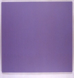
Untitled 146, (1990-93), Multilayered oil on Oyster linen, 60" x 60", The Panza Collection
(Stanza del Camino - Villa Panza Museum, Varese, Italy)
(Photo: Larry Wheelock)
Fredenthal's brush stroke is very subtle as well, with no Impasto to define
boundaries. Such a description makes the works sound like a kind of optical test,
and there is that air to the viewing. It's like being asked to distinguish temperature
variations in a room in which one corner is kept at 70 degrees, another at 71
degrees and so on. With Fredenthal's paintings, the intense concentration
required to detect their Infinitesimal visual shifts gives the viewer a sense
of heightened awareness, of focusing on the very act of seeing.
These works definitely take time to view—appropriately so, as it took the artist
three years and more to make them In what spirit, I wonder, was the paint
applied to the canvas? In a Zen-like trance of "thereness"? With a matter-of-fact
knit-one, purl-two attitude? In any event, Fredenthal in these paintings
out-Reinhardts Ad Relnhardt. She's a painter's painter, with all that term Implies
of integrity of artistic investigation and of complexity in apparently simple
format. It takes a while to come to these works, and many will not feel compelled
to make the effort. But for those who persevere, the seduction is there.
—Reagan Upshaw
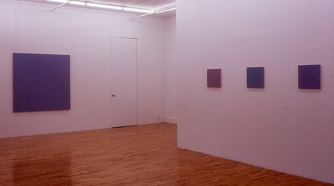
Ruth Ann Fredenthal at Vera Engelhorn
What you see is what you get in Ruth Ann Fredenthal's paintings, but what you see
is contingent upon now long you're willing to look. At first glance you're convinced
that you've come upon some rather low-voltage monochromatic canvases in muted
off-gray violets and blues. The hurried viewer, the one "making the rounds," might
leave it at that. Those fortunate few who were clued in beforehand, however, or
who happened to catch a hint of a strange animation in the paintings' color fields
and stuck around to gaze intently at the works, must have found this to be one of
the more rewarding shows of the fall season.
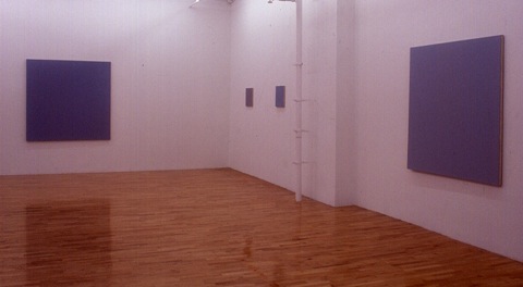
One Person Exhibition, 1989, Vera Engelhorn Gallery, SOHO, NYC (Photo: WoWe)
Large paintings from left to right:
Untitled 133 (1988-89), Multilayered oil on Oyster linen, 66" x 66", The Panza Collection
Untitled 130 (1987-88), Multilayered oil on Oyster linen, 60" x 60", The Panza Collection,
(Villa Panza Museum, Varese, Italy)
Fredenthal works with microtonalities of color, something akin to LaMonte Young's
music. If you look at her paintings long enough, you'll notice that their surfaces are
divided into staggered rows of interlocking planes that fit together along softly
rounded interlocking edges that resemble chains of jigsaw-puzzle pieces. The
regularity and repetition of this curvilinear tongue and groove reads as systematic
notation. And yet, even as you register the arithmetical structures organizing the
work, you become aware of another element or "voice," that of light-filled color.
As soon as you notice the difference in color temperature from one band to another,
the interlocking planes begin to declare their separate indentities as primary and
secondary hues. The gray panels open up into cloud banks of light.
One Person Exhibition, 1989, Vera Engelhorn Gallery, SOHO, NYC (Photo: WoWe)
This transformation takes place in painting after painting, yet it's never quite the same
and is always a surprise. Once you see the color divisions, the graphic and spatial
readings of each painting fire simultaneously. The works have a strong object-quality
as well. Because of the sidelong way their color is perceived—out of the corner of your
eye—the paintings appear to advance a bit from their physical surfaces. Op art
achieved something of this retinality, but it was much noisier about it and that one effect
was pretty much the end ot the story. In Fredenthal's work, by contrast, many ways of
seeing blossom forth from a modestly drab first impression. There is nothing inherently
spiritual or symbolic about these paintings, grounded as they are in the phenomenology
of the concrete, but I can envision a chapel setting for a series of them.
In their unobtrusive manner, they are miraculous.
—Stephen Westfall
Ruth Ann Fredenthal at the Clocktower
It is rare these days for an artist's first solo show to be a retrospective, but such was
the case with Ruth Ann Fredenthal's debut at the Clocktower. A colorist of long standing,
Fredenthal's work in this show spanned the period from 1973 to '80, years in which her
general structural and expressive goals remained the same, but particular compositions
and color concerns evolved.
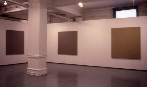
One Person Exhibition - 10 Year Retrospective, 1980, PS 1, (Photo: Erik Saxon)
Institute for Urban Resources, The Clocktower, NYC.
Paintings from left to right:
Untitled 48 (1976-77), Multilayered oil on Ulster, linen, 66" x 60", Private Collection, Italy
Untitled 70 (1978-79), Multilayered oil on Oyster linen, 66" x 66", The Panza Collection
Untitled 69 (1978-79), Multilayered oil on Oyster linen, 72" x 66"
Fredenthal's arena is the expressive and spiritual content of color. Each canvas comprises
a color she calls the "mass tone" of the painting, and one or more variations of that tone
produced by mixing it with tiny amounts of other hues. The canvases are square or nearly
so, divided simply into rectilinear sections. The sections join, as puzzle pieces do, with
curving, interlocking edges, so that the color sections seem to fit together naturally rather
than simply abut. In the earlier works, the curves themselves were large and assertive,
playful and almost imagistic. In works dating from the middle 70s and later, the curves
become very small in compass, occasionally less than two inches wide.
The regular, meandering curves of her jigsaw pieces reflect her debt to abstractionist Paul
Feeley, with whom she studied at Bennington College. (Fredenthal painted all his wooden
sculptures, and executed the large Sculpture Court piece shown at the Guggenheim after
his death). Though Fredenthal had painted curves before their meeting, it was he who led
her to clean them up and make them uniform.
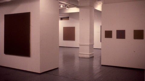
One Person Exhibition - 10 Year Retrospective, 1980, PS 1, (Photo: Erik Saxon)
Institute for Urban Resources, The Clocktower, NYC
This curving, interlocking structure, however, is nearly invisible in Fredenthal's paintings.
After a few minutes of looking, the minuscule color differences among the sections of a
painting reach the threshold of perception. Most viewers perceive only a few of her carefully
painted joinings and only some of her color variations. Many leave thinking they have just
seen monochromes. Fredenthal is not overly disturbed by this; she's after the "whole" experience
of the colors, and emphasizes that the subdivisions are only part of the point. Her brush technique
offers virtually no evidence of touch, and the weave of the linen remains visible beneath the eight
or more coats of oil paint she habitually applies; this textural uniformity adds to the integrated feel
of the paintings.
Her colors evolve, in this show, from warm, sienna-based earth tones, resonant with ambers and
flesh colors, to warm and then cooler grays. The paintings, engulfing the viewer, serve as fields
for the eye's own dancing afterimages. Two of the latest paintings are a mauve gray and a steel
gray respectively, each with numerous but almost imperceptible subdivisions. No brushstroke gives
away the positions of her jigsaw joinings, and the intense gallery lights melt color differences away.
These paintings are to colors what chords are to music—complex wholes affected by but superior to
their individual components.
—Ellen Lubell